This Will Make You Look At New York In A Whole New Way (PHOTOS)

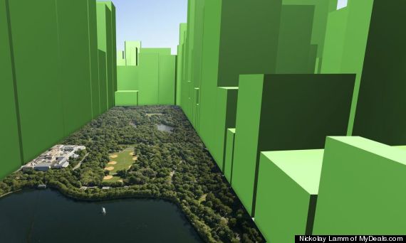
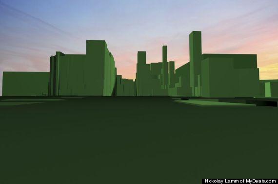
If New York’s buildings were as high as its residents are wealthy, the city’s skyline would look vastly different. That’s just what Nickolay Lamm set out to capture in a series of maps that were first produced on MyDeals.com.
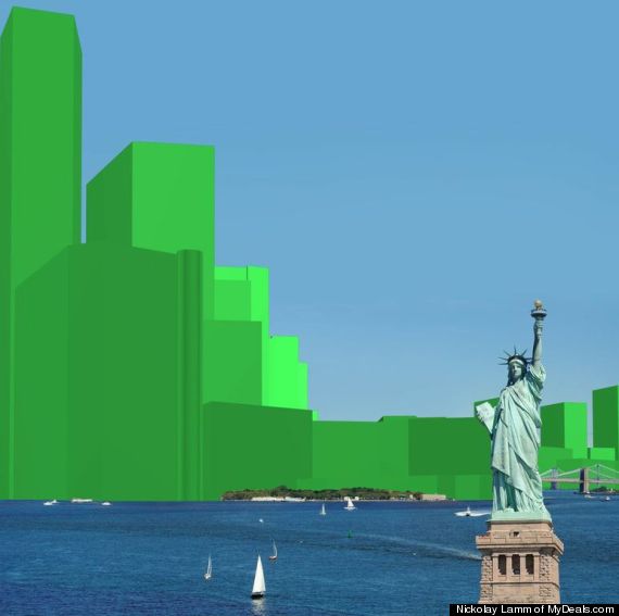
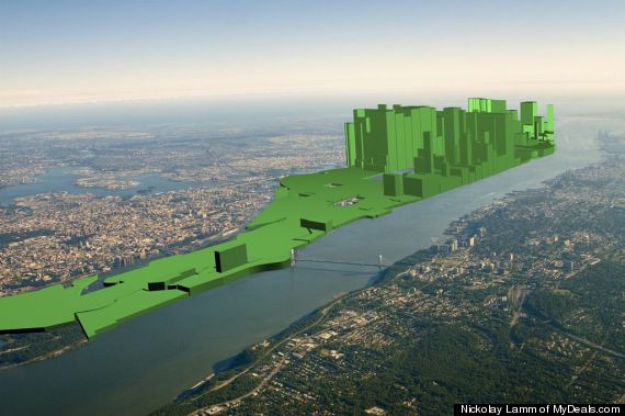
In an effort to visualize what wealth inequality looks like, Lamm superimposed bar graphs representing median household net worth onto a map of New York City. For example, an area with a net worth of $400,000 would be represented by a bar 4 cm high, while a neighborhood with a net worth of $50,000 would only be .5 cm high.
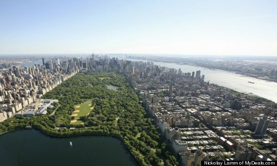
Here’s a look at the neighborhoods that surround Manhattan’s Central Park, where some of the wealthiest people in New York live:
And here is a visualization of the area’s wealth:
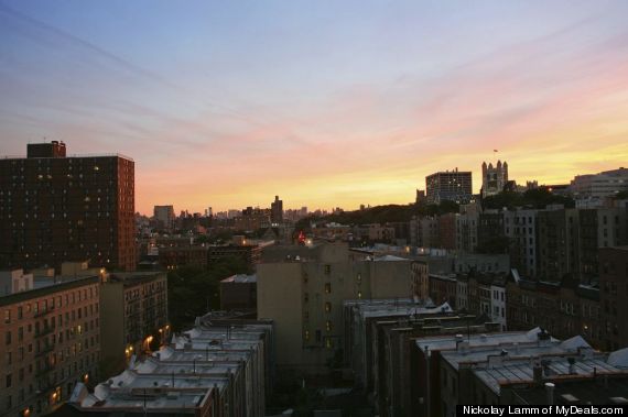
Just north of Central Park is Harlem:
As you can see, Harlem’s wealth is dwarfed by that of its surrounding neighborhoods:
Here’s the southern-most part of Manhattan, a.k.a. the Financial District:
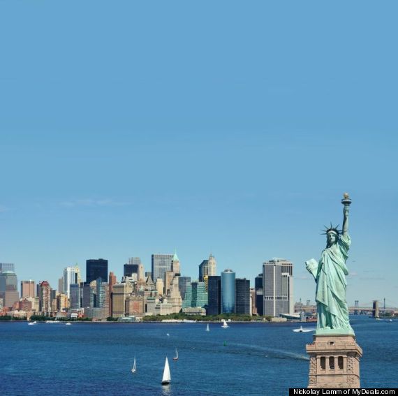
And here’s a rendering of the area’s wealth:
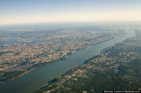
Finally, here is a view of all of Manhattan, with uptown in the bottom left corner and downtown in the upper right.
And here’s the island as represented by its wealth:
To check our more of Lamm’s visualizations, click here.
Πηγή: Huffington Post




Σχόλια Facebook